|

> Human-Computer Interaction > UX Design > Accessibility

A comprehensive interface inspired by Calgary Transit, focusing on accessibility and ease of use. Developed using Task-Centered System Design methodology with iterative prototyping and user testing.

Project Overview

Developed as a team project for CPSC 481, this Bus Ticketing Kiosk simplifies transit ticket purchases. The project evolved from initial user research to sophisticated prototypes through the Task-Centered System Design (TCSD) approach.

Key objectives included reducing wait times, enhancing accessibility for diverse users, and supporting core tasks like ticket purchases, student verification, and transit card reloads.

Project Overview Screenshot

User Personas

We identified six distinct user groups to ensure comprehensive usability:

Regular Commuter (Wang, 27)
Tech-savvy professional who needs quick, efficient ticket transactions during daily commute.
Tourist (Jallow, 30)
Unfamiliar with local transit systems, requires clear language support and simple navigation.
Senior User (Margaret, 72)
Occasional user who prefers simple interfaces with large text and clear instructions.
Student (Alex, 23)
Frequent but irregular user who needs discounted fares and student verification.
Youth/Minor (Sophie, 14)
Requires parental-approved, safe transaction methods with clear guidance.
Group User (Jim, 24)
Occasionally uses kiosk with friends for purchasing multiple tickets at once.
Identification Phase

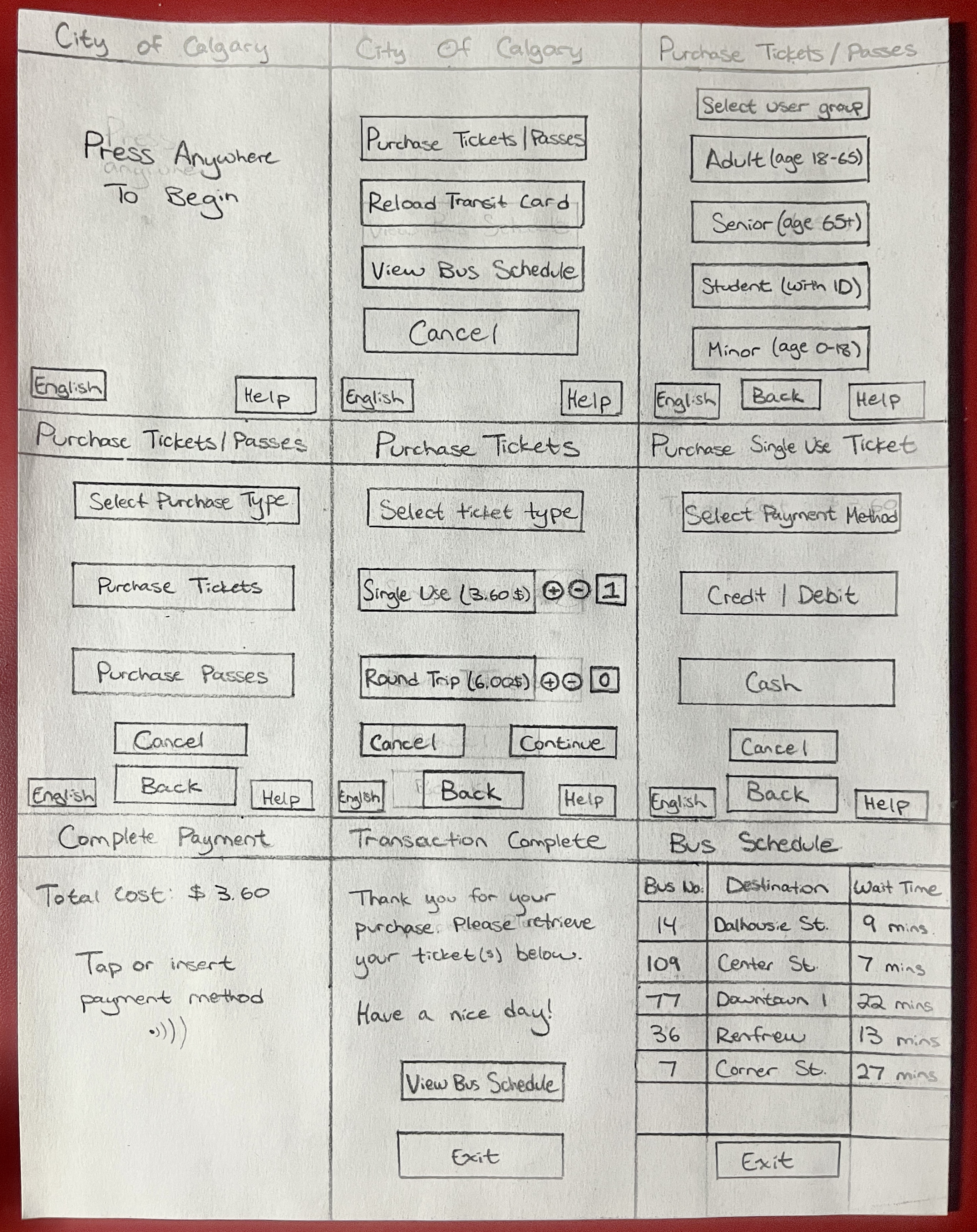
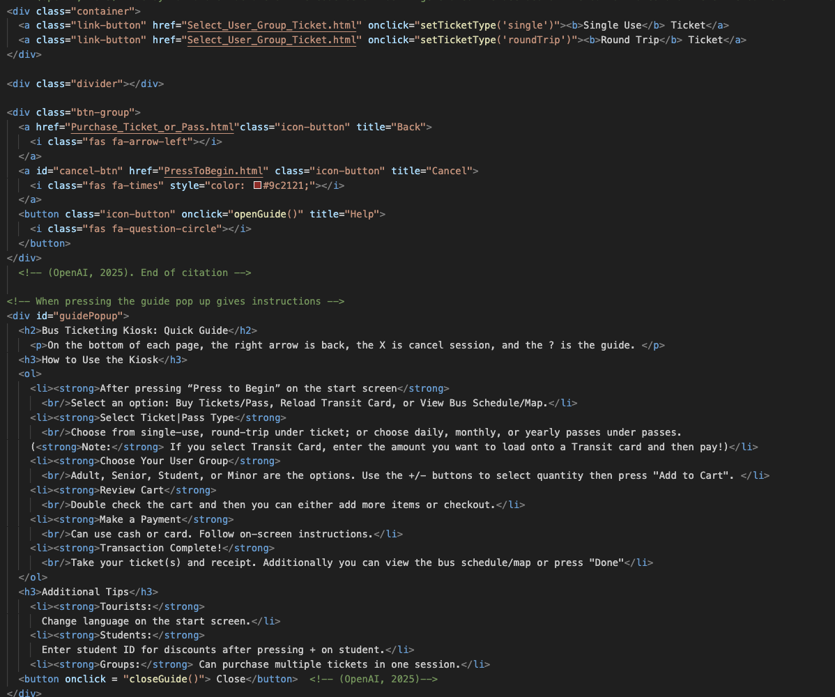
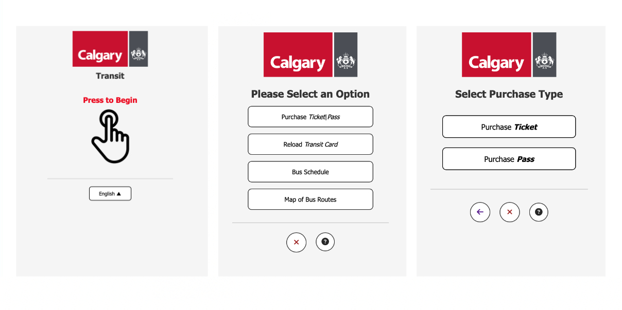
User & Task Identification

Through extensive user interviews and analysis, we identified critical tasks including:

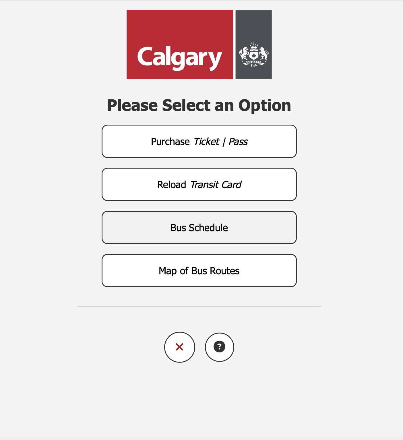
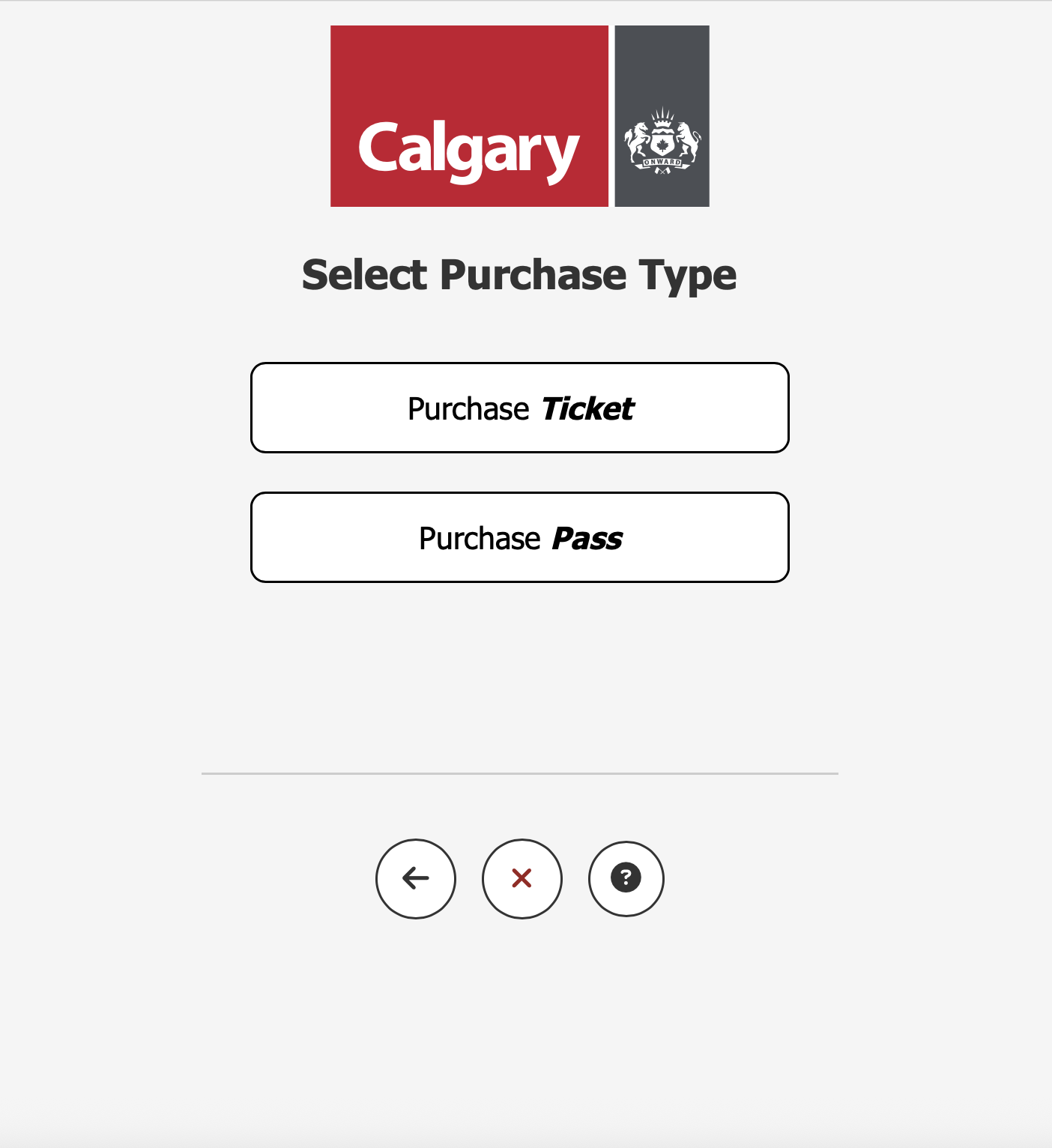
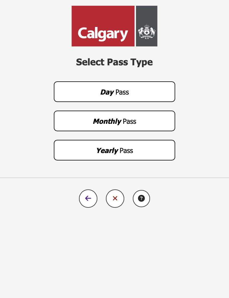
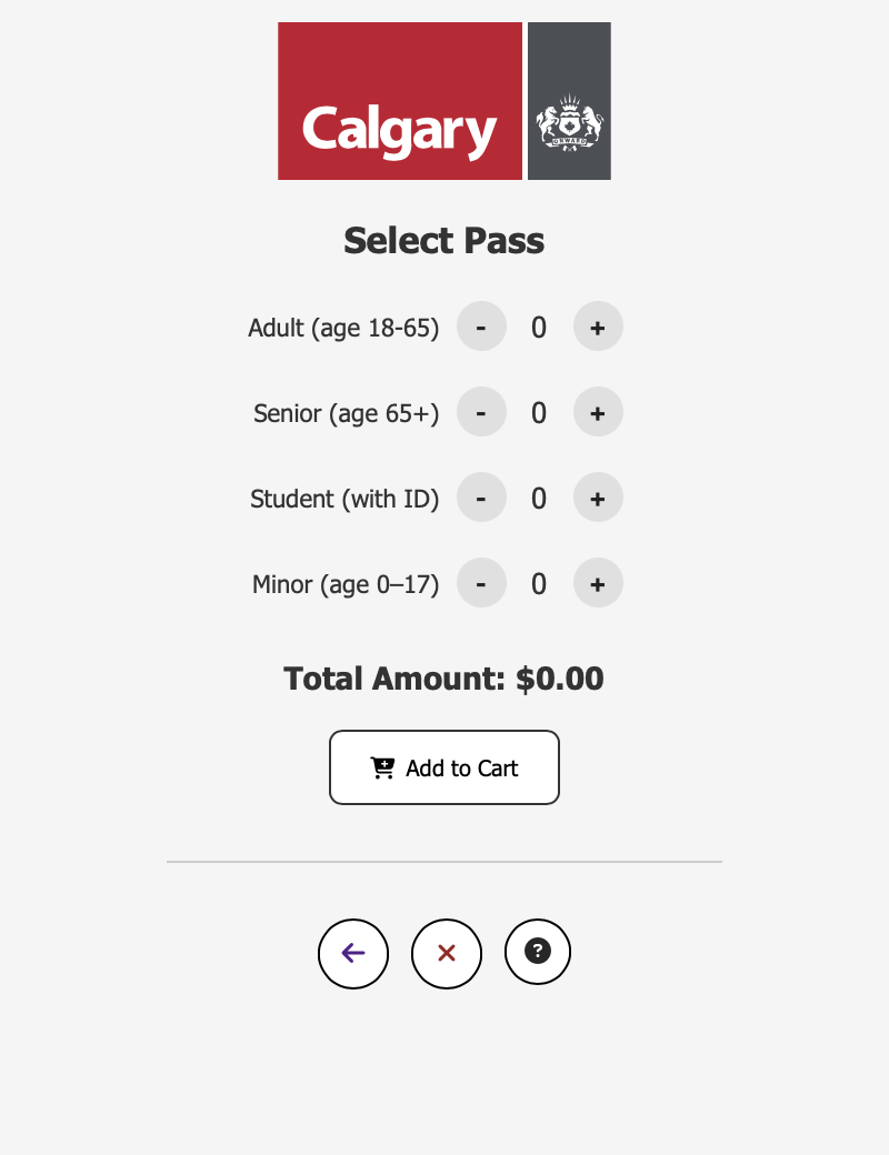
  • Purchasing various ticket types (single-use, round-trip, monthly/yearly passes)
  • Reloading prepaid transit cards
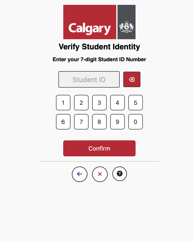
  • Verifying student IDs for discounts
  • Handling multiple tickets for group travel
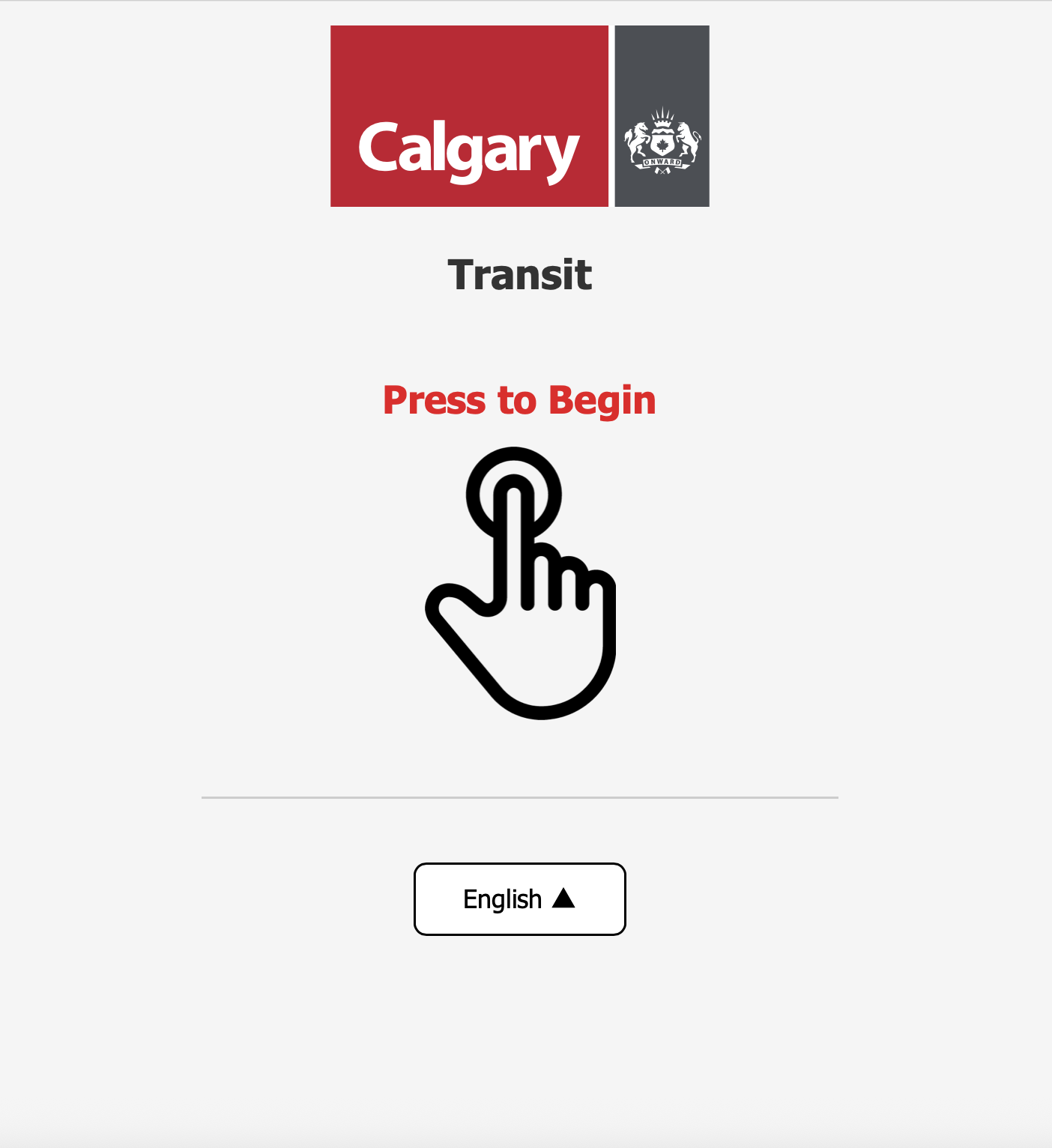
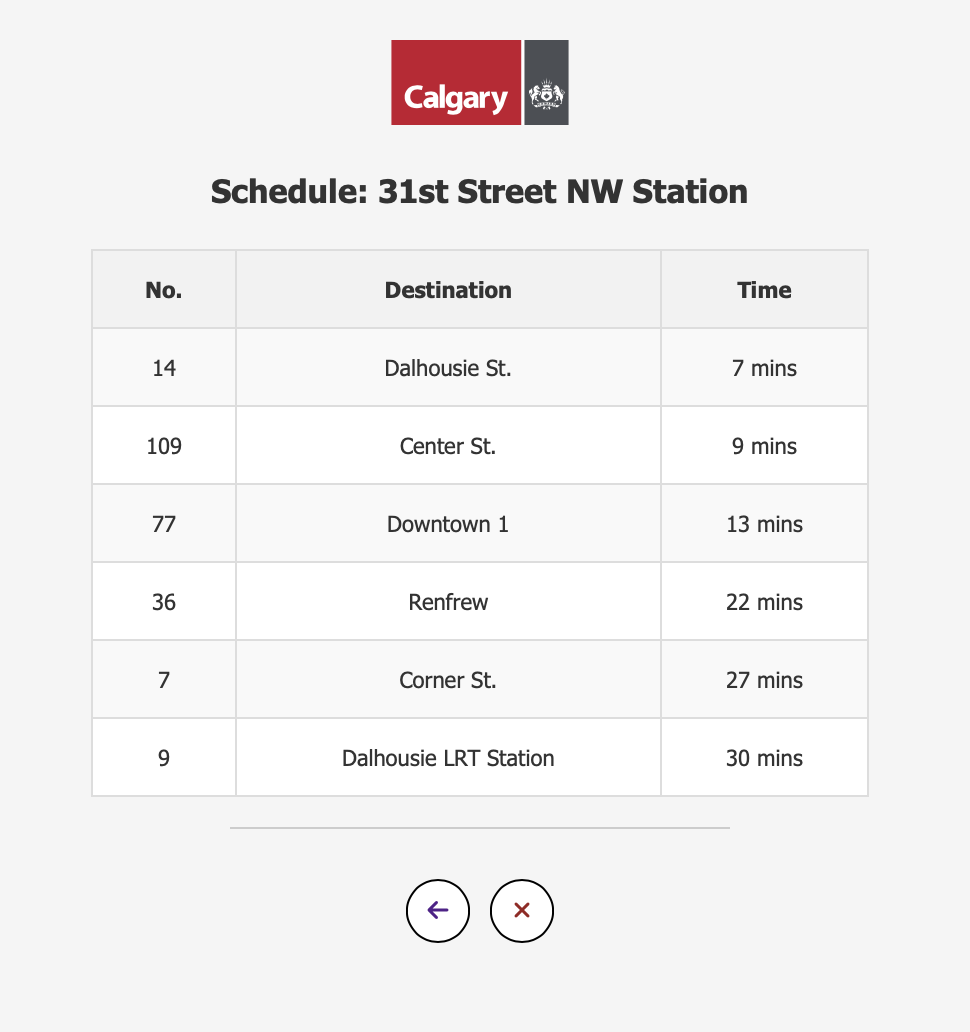
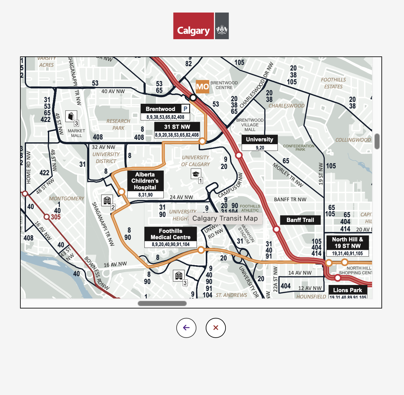
  • Language selection and real-time schedule viewing

These tasks directly informed our system requirements and design priorities.

Design Process Timeline

Phase 1

User Research

Identified 6 key user personas through interviews and observations

Phase 2

Task Analysis

Defined core tasks and system requirements based on user needs

Phase 3

Low-Fidelity Prototypes

Created sketches and storyboards to visualize initial concepts

Phase 4

Horizontal Prototype

Developed complete HTML/CSS prototype showing all functionalities

Phase 5

Vertical Prototype

Created interactive high-fidelity prototype with refined interactions

Phase 6

Evaluation & Refinement

Conducted usability testing and heuristic evaluations

Low Fidelity Prototyping

Early-stage sketches and storyboards addressed preliminary requirements and explored basic layout ideas, allowing us to visualize and iterate on the initial design concepts quickly.

Key focus areas included simplified navigation, large interactive elements for accessibility, and clear visual hierarchy.

Low Fidelity Prototypes
Horizontal Prototype

Horizontal Prototype

Our comprehensive horizontal prototype illustrated all intended functionalities without detailed interactions, serving as a basis for usability feedback and further refinement of user flows.

Significant improvements from low-fidelity versions included:

  • Removed redundant interactions (like user group selection for reloads)
  • Clearer differentiation between navigation buttons
  • Better integration of shortcuts for expert users

Interface Gallery

Vertical Prototype

The interactive vertical prototype incorporated all feedback and refinements from previous stages, resulting in a polished, high-fidelity implementation.

Key enhancements included:

  • Consistent button layout across all screens
  • Comprehensive accessibility improvements
  • Clear error messages and input validation
  • Streamlined navigation with fewer unnecessary screens
Vertical Prototype Screens

Key Achievements

  • Implemented WCAG accessibility standards across all screens
  • Reduced average transaction time by 30% through streamlined flows
  • Achieved 95% success rate in usability testing
  • Developed comprehensive error handling system
  • Created adaptable design for various user demographics

Challenges & Solutions

  • Challenge: Diverse user needs
    Solution: Persona-specific flows with shared core functionality
  • Challenge: Accessibility requirements
    Solution: Large touch targets, high contrast, screen reader support
  • Challenge: Complex transaction paths
    Solution: Progressive disclosure and clear progress indicators

Heuristic Evaluation

Strengths

  • Clear and consistent navigation
  • Effective error prevention
  • Logical user flow matching real-world expectations
  • Strong visual hierarchy and affordances
  • Flexible for both novice and expert users

Areas for Improvement

  • Complete multilingual support implementation
  • Enhanced timeout functionality
  • Stronger save-state implementation
  • Better use of color contrast
  • More prominent help functionality

Reflections & Learnings

This project provided invaluable experience in iterative UX/UI design, heuristic evaluations, and real-world usability considerations. Key takeaways included:

  • The importance of thorough user research in informing design decisions
  • How prototyping at different fidelities serves distinct purposes in the design process
  • The value of core design principles and methodologies
  • The complexity of balancing simplicity with functionality and efficiency

My specific contributions included but was not limited to user research, design and prototpying contributions, visual consistency maintenance across screens, implementing clear navigation logic, and enhancing accessibility through the integration of iterative feedback takeaways.

Lessons Learned